Navigating a website or app is usually a pretty standard process. You head to the URL or launch the app, do what you need to do, and get on with your day. But sometimes, you’re engaged in a way that you’ve never been before. You’re surprised, delighted, or affected in some other way that gives you a giggle or even makes you love the experience. That surprise-and-delight: That’s the secret weapon to user experience and design.
When that happens, it’s very deliberate. That’s a sign of a good UX designer. UX stands for user experience, an important piece of technology design. A well-designed app, website, or software doesn’t just work. It isn’t just pretty. It elicits a response from its users that makes them love using it time and time again. Want to know more? Here are five great examples of user experiences that surprise and delight us.
Mailchimp’s Sweaty Monkey Finger
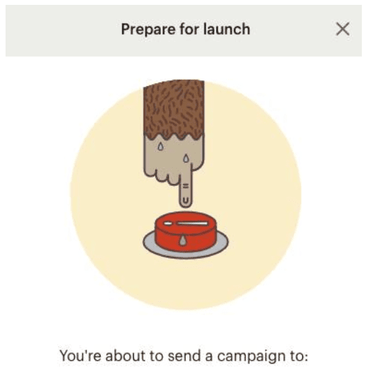
Mailchimp is a beautifully designed email program that has its user experience down to a science. The application is loaded with quippy phrasing and interactional designs. And, of course, it’s super easy to use. But there’s one design element in particular that delights us every time: the sweaty monkey arm hesitating to push the send button. This simple animation elicits hesitation and anxiety to hit the send button every time you want to send out an email. It’s brilliant!
Once you hit send, it’s all over. You can’t take it back. So why not make users question whether they’re actually ready to hit send? We wish we knew the stats on how many people actually go back to their emails to triple check before sending. Because it really makes you question yourself.
Photo reads: Prepare for launch. You’re about to send a campaign to:
Twitter’s Fail Whale (and Other Fails)
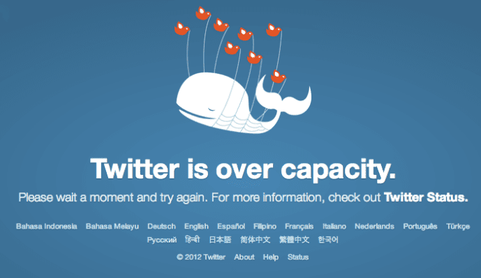
It’s a real bummer when your site is at capacity and users can’t get on. In the old days (when a Twitter outage was somewhat frequent), you got the famous “Fail Whale.” It just made the outage a little more endearing.
Similar to the Twitter Fail Whale, a lot of brands show off their personalities with their 404 pages. Rather than just telling the user the page doesn’t exist (and somebody goofed), they use it as an opportunity to show a little personality. Here’s an example of a 404 page we created for a client.
Why serve up a boring page when you can surprise users with a little humor and make their user experience a bit unique – and memorable?
Photo reads: Twitter is over capacity. Please wait a moment and try again. For more information, check out Twitter Status.
The Domino’s Pizza Tracker
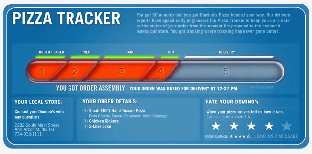
If you’ve never ordered a pizza from the Domino’s app, stop reading this and do it now. Not only is it super easy, it’s also kind of fun. That’s all thanks to their “Pizza Tracker,” a design element that shows you where your pizza is on its journey to you. When you order Domino’s, you ALWAYS know what’s happening with your order. Even better, while you’re waiting, it prompts you to send words of encouragement to your pizza maker. Talk about a unique user experience. How fun is that!?
The ability to track the progress of something you’re waiting for definitely keeps the complaints and questions at bay. For Domino’s, it cuts down on all the calls from customers checking in on their pizza. Plus, it’s fun to watch!
Photo reads: Pizza tracker, tells the user how long they have to wait for their pizza, shows the progress of the pizza as it’s being made, gives local store info, order details, and a place to rate the pizza and experience.
Dropbox Paper’s Words of Encouragement
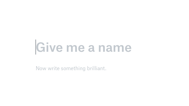
The blank page is always intimidating – no matter how long you’ve been writing. Dropbox Paper knows that, which is why they don’t leave users with a blank page. When you’re ready to create a new document, you’re not on your own. There are words of encouragement awaiting you. Just another fun UX design touch that users, we here at RTS Labs included, love.
Photo reads: Give me a name. Now write something brilliant.
Salesforce Trailhead
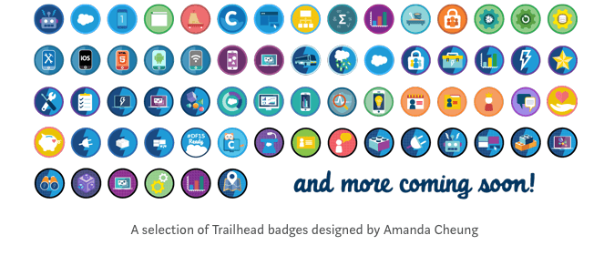
Salesforce is a powerful, all-encompassing software with so much potential. With all its features and services, it can be extremely overwhelming to learn. In order to ensure users have the tools and knowledge needed to be successful, Salesforce built a massive learning platform that makes learning the tool fun. Salesforce Trailhead is easy, accessible, hands on, and engaging, thanks to some solid UX design. It’s gamification at its finest! There are modules to conquer, badges to acquire, and fun characters such as Rob Burgle, the sneaky salesperson who steals his company’s sales leads. There are even pirates!
Photo shows dozens of colorful Trailhead badges and reads: and more coming soon! A selection of Trailhead badges designed by Amanda Cheung
Design experiences like these create bonds between your technology, your brand, and users by relating to their personalities. When you design a product to have a certain personality – one that is similar to your target user – it’s easier for the technology to catch on.
Do you have a website or app that needs a designer’s touch? Want to implement some new UX design features or take it to the next level? A killer RFP that reflects your personality and the user experience you’re looking for is the place to start.
Get some tips for jazzing up your RFP – while also reflecting the scope of your project more accurately – when you download our guide.

