The rapid adoption of smart phones, tablets, and other touch screen devices has significantly impacted the way in which we interact with the web. This change in user experience demands a change in website design; users require a consistent level of quality, whether visiting a website on their iPhone or their desktop computer.
But how do we accommodate these new screen sizes and interactive formats?

Initially, the response to these new methods of browsing was to create two distinct websites: a leaner mobile version and a full service desktop version for a more traditional access to content and services.
This solution proved problematic in many ways. For the designer, it meant creating two distinct sites for every project they worked on. For users, it made the assumption that visitors accessing sites through mobile devices preferred a reduced version, targeting “on-the-go” needs, such as location and contact information. This assumption is flawed – according to a 2013 Pew Research Study, of the 57 percent of American adults who use mobile internet devices, 34 percent almost exclusively rely on their phones for web access.
This preliminary solution finally proved to be insufficient when tablets and other such devices that blurred the lines between mobile and desktop access gained in popularity. With the dramatic variability in screen width and orientation that was now commonplace, this two site option was no longer viable.
What we needed was a fresh idea.
It came in the form of Ethan Marcotte’s essay, “Responsive Web Design”. Here he presented responsive design as a method of future-proofing websites to accommodate the rapid development of screen sizes and access methods, while still providing full featured access to all users.
What is Responsive Design?
Responsive design is an approach that uses CSS media queries and fluid grids and images to adapt the design of a website to the user’s screen size, orientation, and platform. The underlying idea is that if the website is programmed to detect and adjust to the user’s browser, then one website will be able to accommodate all existing and future screen resolutions automatically.
You don’t have to change devices to experience the effects of responsive design – all you have to do is resize your browser.The way in which our website adjusts to changes in browser size can be seen below:
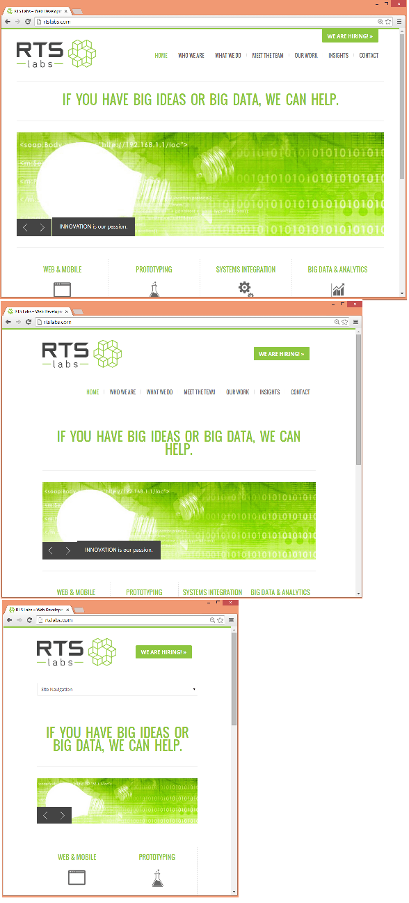
Note the downward shift in the navigation buttons that occurs between the widest and mid-range designs. The narrowest size loses the navigation buttons altogether in exchange for a drop down, optimizing available space while maintaining functionality.
This is just one example of what can be accomplished with responsive design.
How is this accomplished?
While there are many techniques for designing responsively, these three concepts are the most important for starting your website on the right path:
- Fluid Grids – Traditionally, websites were designed by assigning a fixed amount of pixels to each feature. In responsive design, websites use fluid grids instead, assigning each feature to be a specific proportion of the whole. This allows all of the elements in the website to adjust their width in relation to each other as the page shrinks or expands.
- Fluid Images – In responsive design, images need to adjust to the size of the browser without becoming stretched or blurry. While the needs of your specific website should dictate how your images are formatted, some such methods are setting the maximum width for an image to 100%, hiding and revealing portions of an image, or creating sliding composite images.
- Media Queries – CSS media queries allow you to obtain information about the browser in use so that you can assign the appropriate style sheet. This allows you to distinguish between different sizes where the fluid grids start to break down and transition to a more suitable design, e.g. switching between buttons and a drop down for navigation.
RTS Labs has extensive experience creating optimal user experiences for every platform through the implementation of these, and many other, responsive design techniques. If you have any questions related to responsive design, or any other web development needs, give us a call today.