Mobile apps are a dime a dozen. With roughly 4 million of them between iTunes and Google Play, the choices are almost limitless – and overwhelming. But not all apps are created equal. Their success depends largely on how well they are designed, and how user-friendly they are.
Think about all the apps on your phone. What do the apps you use the most have in common? They are probably:
- Easy to use
- Serving an important function for you
- Beautifully designed
- Engaging and/or fun
- Clean and uncluttered
In development terms, all these aspects boil down to the user experience, or UX design. The UX design of an app can make or break its success. Your app could do the coolest things – things no app has ever done before – but if the user experience is lacking and your users can’t figure out how to use it, it will never gain traction.
Creating an amazing user experience is no easy task but it can be done, if you stay away from these 5 mobile UX design mistakes to avoid.
1. Poor navigation
If it takes several minutes for users to find what they’re looking for or figure out how to accomplish a certain task, you need to rethink your app’s navigation. Poor navigation can be extremely frustrating to a user. Eventually, it will cost you, as users simply drop off and stop using your app.
Most users download apps that are going to increase efficiency or at least make something more readily accessible (like social media or a web application). If using your app is inefficient, it’s defeating the purpose for the user.
One of the most common contributing factors to poor navigation is not designing for mobile environments. If your app is just a scaled version of your website, the navigation is going to be too cluttered and confusing. Speed and responsiveness are important to users. Your navigation should be intuitive.
Pro tip: If it takes more than three taps for a user to find what they’re looking for, your navigation needs to be improved.
2. Cluttered screen
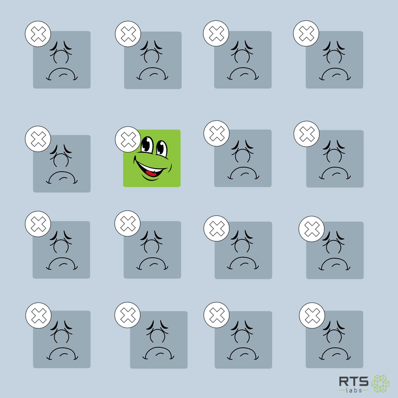
Good UX design is clean and simple. Cluttered screens not only look cheap – they overwhelm the user with options. Almost one in four users only uses a mobile app once. First impressions are crucial. If users can’t figure out how to use your app the first time they open it, they likely won’t continue using it.
Pro tip: Borrow design elements that mobile users are already familiar with. For example, the hamburger menu for navigation, and icons like the magnifying glass for search, or the ellipsis icon for more information.
3. Too many features
You don’t need to offer a ton of features to make your app successful. In fact, lean startup principles advise against offering too many features. If you want to build your app right the first time, it’s best to start with the minimal amount of features. Focus on your app’s core functionality and add new features based on user needs and wants.
Offering too many features up front can lead to cluttered design, poor navigation, and poor user adoption.
Pro tip: Read about building an MVP the right way.
4. Notification overload
Be careful about your use of pop-up screens and push notifications. Users tend to find them intrusive and annoying. Too many of either could send the wrong message and/or cause red flags. If at first download, users get a ton of permission requests, they could end up deleting the app for privacy concerns. If a permission is critical, find an appropriate time to get it and give a reason why you need it.
Pop-up ads or overuse of ads in general is also a bad idea. If your ads interfere with the user experience, you risk having your app deleted. Yes, ads are an important revenue stream, but be mindful of where they are and how they appear.
Pro tip: Push notifications can be helpful for users and can be a great user education or engagement tool. Think carefully, however, about the triggers you choose for push notifications. If it doesn’t add value, don’t push it out.
5. Never updating your app
One of the biggest mistakes you can make is building your app and then never updating it. “Version 1” will never be the best version. Just like technology is always changing, so are your users’ needs.
Make sure you are collecting feedback and monitoring in-app metrics to find ways to improve the user experience. The development process should be ongoing. As more users download your app, insights will present themselves, bugs will become apparent, and design improvements will be necessary.
Avoid making these common UX design mistakes, and you’ll find your app more likely to succeed!
Looking to build a top-notch mobile app? Give us a call and let’s discuss how we can work together to create the best mobile app for your needs.