A picture is worth a thousand words, but how much is data visualization worth? A lot actually, when it comes to running a business. When we say data visualization, we don’t mean pie charts and line graphs. That type of visual is only capable of showing dozens of data points, not the hundreds of thousands that business intelligence collects on a daily basis.
You may have business intelligence or other types of software collecting data, but what are you doing with it? Sometimes it’s not about how much data you have; it’s about how you use it. Our brains are not capable of making sense of thousands or even hundreds of data points. After all, we’re humans, not robots. That’s where visuals come in to help tell the story!
Data visualizations can do a lot for your business – beyond that presentation you plan to give your investors. Here are 5 ways data visualization can benefit your business.
1. Tell better stories
There’s a reason users flock to social media sites like Instagram and Pinterest. We’re a visual society. Visuals can tell stories better than charts, blocks of texts, or even presentations. It’s why the first thing you do when you want to show growth is create a line graph. Without out any explanation at all, it conveys growth to the viewer.
Let’s take that concept deeper. What if you wanted to talk about mortality in the United States? Pull out the graphs and charts and watch all the eyes in the room glaze over. But show them a dynamic and compelling data visualization and your story is told. That’s because our eyes and brain work in concert to help us interpret the world around us.
Here’s a great visualization put together by the CDC. There are a lot of stories that could be told just based on viewing and interacting with it – stories about health trends and health priorities in states across the U.S.

2. Make stronger value propositions
You can tell a prospect how amazing your service is until you’re blue in the face. But why do that when you can show them how amazing you are instead? Data visualizations are extremely powerful in marketing, because they show results, catch the eye of your target audience, and reel them in by allowing them to imagine their own stories based on the data they see.
Use data visualizations on lead pages, in case studies, on social media, and even in your blog, and you will convey your proposition in a more compelling way than any block of text could.
Here’s a fairly simple one from Think With Google that shows the use of mobile search when traveling (i.e., why you should use Google Ads to target travelers on mobile devices).
ICYMI, see how travelers use mobile in moments of intent: http://t.co/XLbr7SCrDl pic.twitter.com/8nbVJhPmDZ
— Think with Google (@ThinkwithGoogle) September 16, 2015
3. Communicate information faster
If you’ve been following the news lately, you’ve likely been hearing about climate change. For some people, the stats and facts on how our climate is changing don’t always resonate. So one scientist took to Twitter to make a point about climate change with data visualization.
And, if you happen to live in Florida, the warming oceans are causing your local sea levels to rise. This increases the risk of flooding. pic.twitter.com/o3egNAmVfq
— Ed Hawkins (@ed_hawkins) June 1, 2017
This data is presented in a visually appealing way that allows for easy comprehension. Using techniques such as animation and familiar color associations (blue and green for cooler temperatures and yellow and orange for warmer temperatures), a story unfolds from the data before our very eyes. The image stays with you, even if you don’t know the exact stats.
4. Motivate your team
It’s easy to lose sight of what you’re doing if no one is measuring progress and goals. Your team needs to see where you’ve been as a company and where you want to go.
Harnessing sales data and presenting visually through a custom-designed dashboard is something we’ve done for many clients. When your strategies are driven by guts, your team struggles to see not only how they’re doing but what works and and what doesn’t. They miss out on key insights that visualizations can provide.
Providing a way to visualize the pipeline and measure and monitor sales rep performance can empower employees and fuel growth. In one case we worked on, visualizing data and setting up dashboards grew sales by 24% and lowered sales rep attrition by 90%.
5. Make quick decisions
Millions of years of evolution have conditioned us to make quick decisions based on visual cues. That survival instinct is still present within us. Our vision allows our brains to take shortcuts. It makes processing information faster. While data visualizations are not as easy to process as pictures, they are easier to process than spreadsheets. When it’s time to make a split-second decision about staffing or inventory, it’s easier to look at a visual than it is to try and scan and interpret a chart.
Here’s one example of how the Texas Rangers baseball team uses data visualizations to make better decisions: The Texas Rangers gain a “full 360-degree view” of operations
Not everyone has to make decisions on the spot. Visualizations also help businesses make better decisions even when time isn’t crashing down on them. Econsultancy sites a fascinating and telling study in which three groups of economists were asked to analyze the same set of data. The first group was given a standard statistical analysis. The second group was given the analysis plus a graph. The third group was given only the graph. In the first group, 72% got the answer wrong; 61% in the second group got the answer wrong; and only 3% of the economists in the third group got the answer wrong.
The Takeaway
Data can be the most powerful tool for your business, but only if you leverage it and present it in the right way. Like we said, we are humans, not robots. Spreadsheets and graphs are great, but good visualizations tell the data story better. They make data more accessible and comprehensible to our human brains.
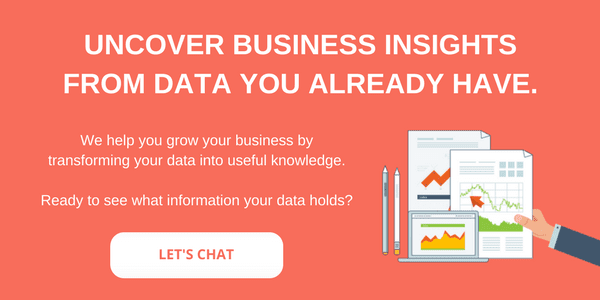
Curious how data visualizations could drastically improve your business processes? Schedule a call with us, and we’ll help you determine how data analytics and visualizations could help accelerate your sales and grow your business.