Not to toot our own horn, but we have a brand new website and we’re pretty excited about it! We’re not shy when it comes to tweaking and perfecting a website (just like we do for software). In fact, we’ve written about the importance of constantly tweaking and testing your website before.
Now that we’ve launched our newest iteration, we thought we’d take the opportunity to show you what we did. Maybe it will give you some fresh ideas to improve your own website. These are four easy ways to increase conversion on your website that worked for us, and we’re hoping they’ll work for you, too.
Refine your marketing
We do things a little differently at RTS Labs – from the way we’ve built our team and culture to the way we approach client relationships and take on projects. But reading the homepage of our old website, that message didn’t really come across. So we tweaked it!
What we did:
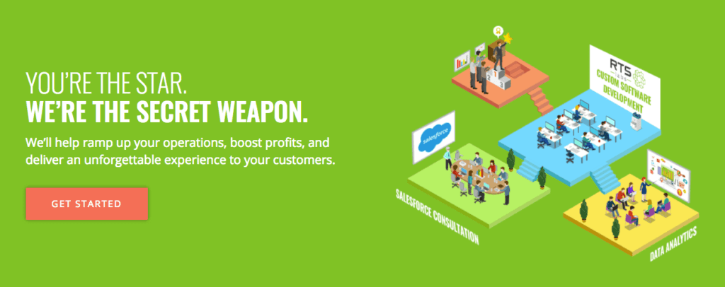
“Software done right the first time” was our old tagline. While it’s catchy and concise, it doesn’t tell the reader how we truly differ from other software developers. So, we took a step back, talked to our clients, and really dug into what made us different and told that story.
Here’s our new tagline and teaser copy:
You’re the star. We’re the secret weapon.
We’ll help ramp up your operations, boost profits, and deliver an unforgettable experience to your customers.
The takeaway:
Does your website convey who you are and what you do? Does it tell your story? Do your points of difference stand out? Take a step back, talk to clients, talk to people who don’t know what you do, and edit away! The user experience is just as much about the copy as it is about your website’s functionality.
Rethink your visuals
Visuals are so important. A good visual has the ability to convey complex ideas, summarize paragraphs of words, or just make a page more compelling. After careful examination, we came up with some visuals for our website that better represent what we do and provide a more compelling story.
What we did:
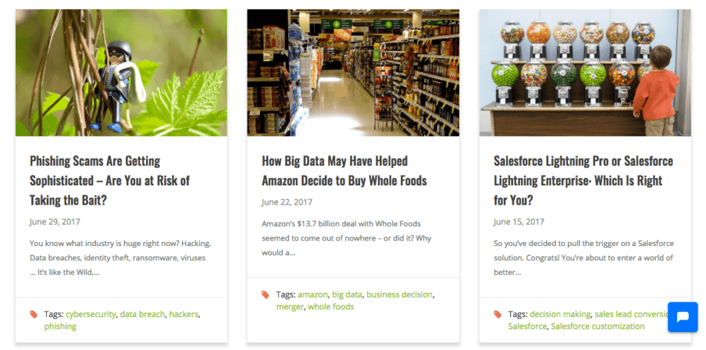
We did a complete redesign of our blog so that the layout was more compelling. Now, instead of a long list of blog titles, we have blocks that display a hero image, title, tags, and the first sentence.
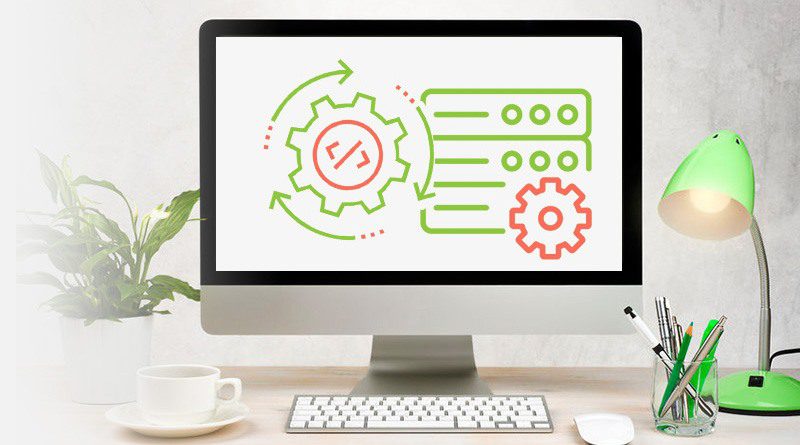
We also added a visual element to the home page that conveys exactly what we do. Rather than making the reader work their way down the page, this hero image summarizes who we are and what we do in an easy to understand visual.
The takeaway:
Visuals are important. Our brains process images 60,000 times faster than we process text. Think carefully about the visuals you use on your website. They need to be more than just pretty stock photography. They need to be compelling while also conveying who you are and what you do.
Add credibility
You can tell people how awesome you are on every page of your website, but that doesn’t mean your readers will believe you. How do you build trust from a total stranger? You add elements that show off your work.
We did that by adding to our client testimonials. We already had great written testimonials, so we added a video to the mix. Now, you can see what we did and hear from an actual client. We also added an “As featured in” bar of logos that represent all the publications that have written about us. Seeing these trusted media sources adds another layer of credibility to our site and to our work.

The takeaway:
Do you have clients who are raving fans? Add their testimonials to your website! Whether you use video or text, testimonials show the reader whom you’ve worked with and how you’ve helped – in their own words.
Remove barriers to conversions
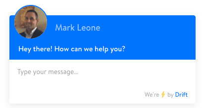
The most important thing you can do for your website is to make it as easy as possible for people to do business with you. In our case, that means making it easy for people to contact us. That’s why we integrated Drift into our website so that as you’re scrolling, a chat box and friendly face (our Director of Business Development) pops up and prompts engagement from the visitor.
We also have lots of big, bold buttons that prompt people to “Contact us” or “Schedule a call.” Calls to action are important to the user experience. They help guide the reader and give them prompts for what to do.
The takeaway:
What is the biggest barrier between you and your customers? Is it understanding? Finding the best way to contact you? Find out what it is and find a way to break it down so it doesn’t stand between you and your customers anymore.
Does this spark some inspiration for your own website? We hope so! Use these ideas as conversation starters so you and your team can start doing a deep dive into your own website. And if you get stuck or have questions, give us a call! If you get even one new idea from the conversation, it will have been worth your time.
ALSO READ:
8 Signs It’s Time for a Website Redesign
6 Tips for Building a Website that Captures Leads and Converts Prospects